Kamryn Truesdale

myOrders Interface Redesign
As the lead UX/UI researcher and designer, I spearheaded the complete redesign of GE Healthcare's primary order booking interface. This project focused on streamlining the order booking process by integrating advanced technologies, including AI-driven automation, while adhering to inclusive design principles. The redesign aimed to enhance efficiency, improve accuracy, and deliver an optimized user experience for a diverse range of users. Through close collaboration with the software development team, I conducted user research, designed intuitive interfaces, and ensured the solution met both functional and accessibility needs.

Challenge
The order booking process for medical devices is inherently complex. Upon receiving an order from the sales team, the order booking team must meticulously verify that all required information and documentation are complete and accurate. This review process is not only time-consuming but also challenging to execute with consistent precision, even for the most experienced order bookers.
Solution
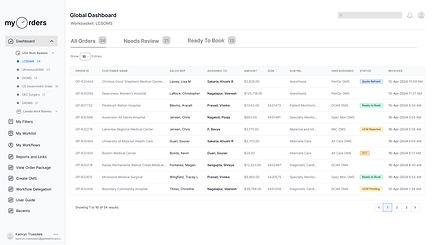
To streamline the order booking process, I led a complete redesign of GE Healthcare's primary order booking interface, focusing on user needs, accuracy, efficiency, and inclusive design principles. Collaborating closely with the software engineering team, I reimagined myOrders into an intuitive, easy-to-navigate interface that leverages advanced technology to enhance workflow efficiency.
The redesigned interface scans incoming orders for required customer information and documentation, generating a comprehensive report that highlights provided details, identifies any missing or incorrect information, and outlines the order booker's next steps. By addressing the most time-consuming aspect of order booking—reviewing and verifying customer data—this redesign significantly reduces the time and effort required, boosting productivity and improving the overall user experience for order bookers.


User Interviews
I conducted user interviews to assess user flow, identify key pain points, and determine necessary pages and potential design solutions.
Research
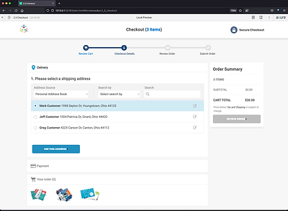
After familiarizing myself with the current user flow, I explored layouts and designs from programs that performed similar tasks to myOrders. While design inspiration for the order queue page was readily available, I initially struggled to find websites that featured an order review and summary flow aligned with our team’s vision. However, after broadening my search, I identified that the order summary and review process could greatly benefit from mirroring the design and flow of checkout pages on retail websites like Target and Amazon. This approach offered valuable insights into creating an intuitive and efficient user experience for our platform.


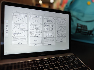
Low Fidelity Sketches
I then began creating low-fidelity sketches. Low-fidelity sketches are simple, rough representations of design ideas that focus on layout, structure, and functionality rather than visual details. They’re important because they allow for quick exploration of concepts, making it easier to iterate and refine the design before investing time in high-fidelity mockups. This process helps identify potential issues early on and ensures the design is aligned with user needs and project goals.
Wireframes
After creating multiple iterations of low-fidelity sketches, I moved on to designing basic wireframes for the queue dashboard and order review and summary pages. Wireframes are simplified, structural blueprints of a design that outline the placement of key elements and the overall functionality of a page without focusing on visual details like colors or typography. They are important because they serve as a bridge between conceptual sketches and high-fidelity prototypes, providing a clear framework for the design. Wireframes help ensure the layout, navigation, and content organization align with user needs and project goals before advancing to more detailed design stages.

Final Mockups